In this article, I would like to explain — How to interpret Contribution charts and what are the common pitfalls to avoid.
So, what is a Contribution Chart?
Contribution Chart is a visual way of representing what marketing inputs drive sales and how much is the impact of each marketing input. It always helps to ease the cognitive burden off your time-starved clients by representing market reality in a visual way.
Types of contributing charts:
Contribution charts are usually plotted in two ways:
1. Absolute contributions summing up to 100
2. Non absolute contributions summing up to 100
1 .Absolute contributions summing up to 100

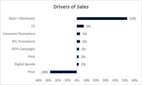
To interpret the above contribution chart, we assume that 100 units of the product have been sold.
Out of the 100 units sold, 53 units would be sold even if the marketer doesn’t invest in any form of advertisement. Basically, these 53 units are sold because of the brand’s equity in the market and the awareness it had created in the customer’s mind in the past. Similarly, 7 units are sold due to TV advertisements and 3 units are sold due to Consumer promotions and BTL promotions each.
Interpreting price correctly is the key to understand the MMM contributions. Many a times, people are misled due to the negative sign present when it comes to representing price. Notice that, when we sum up the contributions in the above chart with the negative sign on price, the sum is 44 not 100.
If we ignore the negative sign on the price, the contributions would sum up to 100. Since sales and price have a negative correlation for most of the brands (damn you Apple!), the price contribution is represented with a negative sign to show the quantity of loss in sales it can cause.
Here, negative sign of the price indicates that 28 units of sales was lost, due to increase in price. This is a notional concept which depicts that 28 additional units of sales could have been gained, had there been no increment in price.
In addition to price, competitor activities are also represented with a negative sign on contribution for the same reason.
2. Non absolute contributions summing up to 100

The first method to interpret contributions is a little confusing for some people or clients. So, there is another method which can be used to interpret the results.
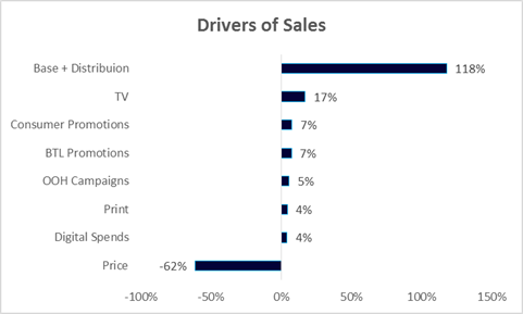
In the above chart, we can see that the total contributions sum to 100% keeping the negative sign intact.
So, what we can say from this chart is that the 162 units of the brand were sold (sum of all positive contributions). Out of the 162 units sold, sale of 118 units comes from Base and distribution. 17 units sold are driven by TV advertisement and so on. And 62 units of sales have been lost, due to price increment. Hence, to total sales would be 100 units.
Pitfalls to avoid while interpreting the contribution charts:
1. Just relying on contributions:
Market Mix Models are interpreted with a holistic approach. Just using contribution percentages is not a correct way to solve a Market Mix Modeling problem. What follows after contribution charts, is computing ROI.
There could be a certain variable which would appear to show contributions in-line with the data used, but would show erratic ROI figures. In such a scenario, contributions are adjusted to get all the results in-line.
2. Not comparing the contributions with the benchmark:
It is suggested to compare the contributions of the model, with the benchmark figures of a similar brand/category to gauge how accurate the contribution results are. This helps in validating the results before reaching the ROI computation phase. Models can be tweaked to make the results more accurate from domain perspective.
3. Balancing Statistics and Domain:
Some MMM models built would be statistically robust, but may not make business sense or vice versa. Domain knowledge should be used in conjunction with statistics to draw upon business insights.
So, these are a few of things to be taken into consideration, while working on MMM. Of course, MMM is a vast topic and has further nuances to it.


